Prologue
Antare had an idea for a new type of smart body-worn camera that is always recording. Realising this idea, we thought we were changing the nature of surveillance and intelligence.
But we were actually redesigning how reality gets presented - and we soon discovered the consequences of getting that wrong.

Bodyworn camera Always recording
metadata
event
event
in feed
decision
Act I
New methods require new models.
Antare set out to disrupt physical security by introducing an intelligent body-worn camera that is always on, massively increasing observable reality. Traditional security systems miss incidents - but ours risked creating too many.
We needed a place and a method to surface it.
The traditional datagrid that forms the backbone of every DEMS works great when humans have pre-filtered your event list by pressing "record."
Industry standard

A typical DEMS datagrid: fine for 5 events; useless for 500.
Our first attempt

My first instinct was to improve what exists. Only then did I ask what else there could be.
But a datagrid clearly wasn't going to work when clips go from 5 per camera, per day, to 200+. You can improve design as much as you want - if the fundamental model is wrong, you're not improving anything.
Borrowing from somewhere unexpected
Social media had already solved one problem: humans scanning large numbers of events - not operationally, but cognitively. Maybe this could work for us…
Act II
Accidentally designing a language between AI and humans.
Populating the feed are countless AI-identified and AI-summarised events. Even camera-wearers pressing their button have the resulting footage parsed by AI.
But to do that right, we need to generate: narrative, identity, trust, classification and explanation. I set about drafting frameworks - contracts between AI and human - that would answer:
- What constitutes an event?
- What sort of event is it?
- What is the overall story and main narrative beats?
- Why might it be important?

Anatomy of an event card
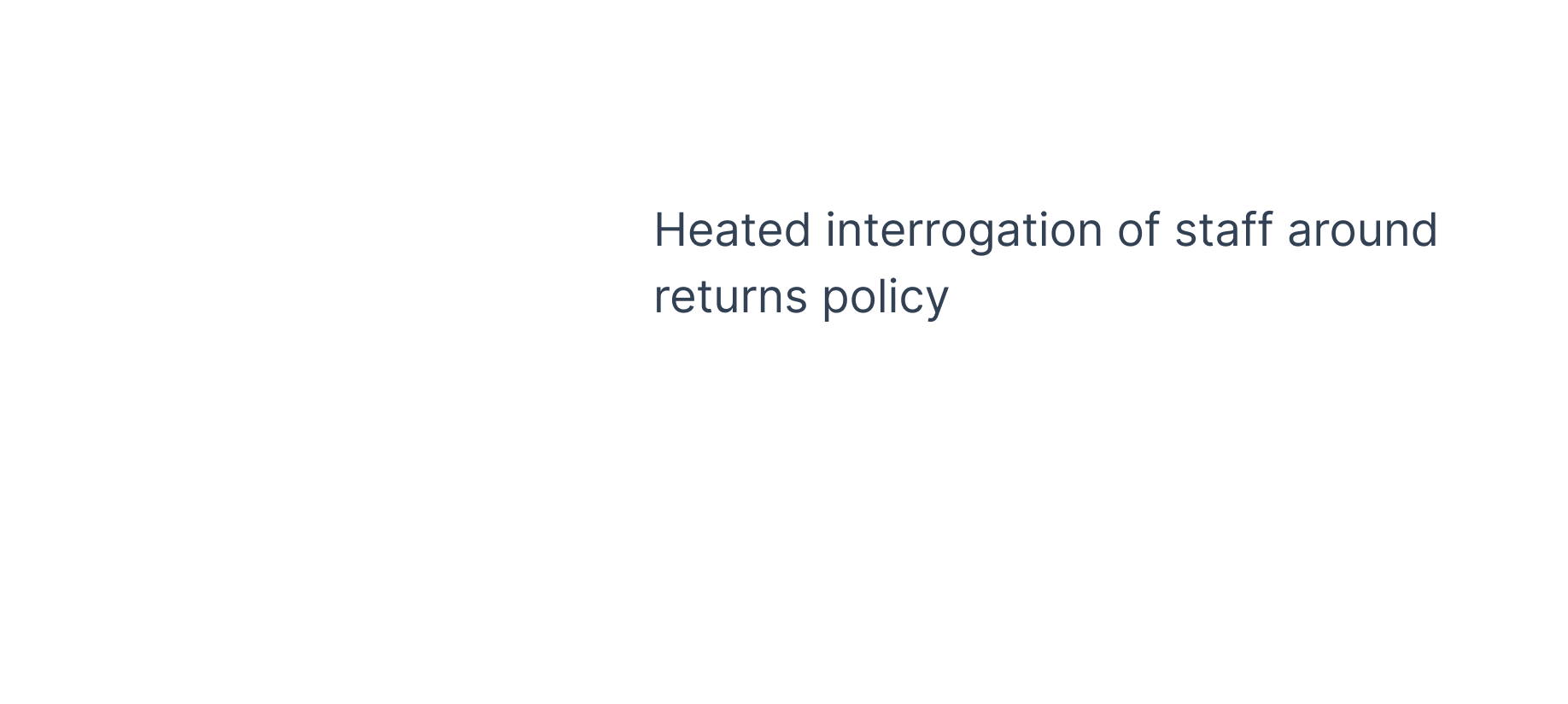
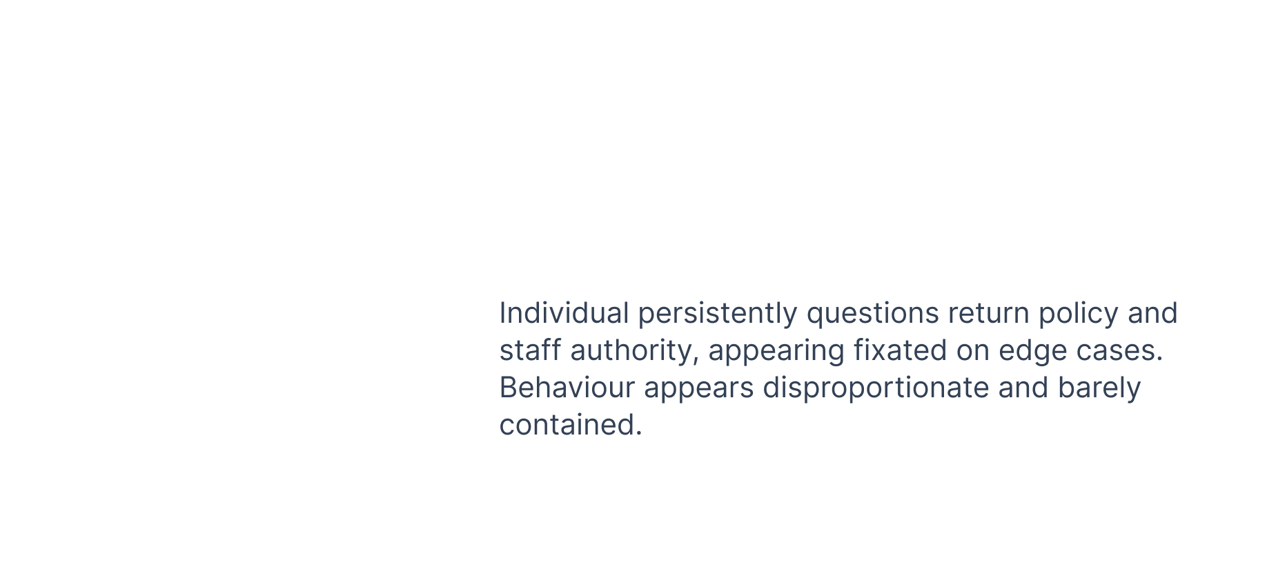
Event cards are the atoms of the feed. Inter-connected chunks of system and AI-generated data - independently and collectively verifiable. Every visible field is an explicit AI contract.





| Layer | Source | Purpose |
|---|---|---|
| Human action row | Other users | Update, reassure, validate |
| Status row | System + wearer | Urgency + orientation |
| Impact colour lozenge | AI + design system | "How worried should I be?" |
| Title | AI | Scannable in 2 seconds |
| Summary | AI | One-line story for the feed |
| Thumbnail + key moments | AI + video UX | Trust / verification |
| Metadata | System | Context, geographic and staff orientation |
Impact level, title language, key moment, thumbnail choice and ultimately video and transcript evidence all line up and agree with each other. Even an event that is wrongly classified doesn't erode trust - there is still visible internal consistency.
We realised there wasn't one feed, but two
Interviewing security professionals, two distinct mental models emerged:
- Research & review - open minded, information gathering, not guided by a single goal
- Respond - focused, single-minded, fire-fighting and minimising
Chronological · all events

Priority · concern + risk + critical

Same org, same day - different job to be done.
Everything looked right
We tested with customers, dummy data, synthetic data, actors improvising events, footage of us in the office.
It looked great. Worked better than we expected.
Then...
Act III
Reality arrives.
Then we received our first full day of footage from a real customer
And it was totally wrong.
Not because AI failed. Not because summaries were bad. Because something felt wrong.


"It's overwhelming."The customer summed it up best
Act IV
Different types of wrong.
For something so clearly broken, there was pressure to fix it immediately. But the interesting thing wasn't that real data felt "wrong" - it was wrong in several different ways. As I unpacked the feed, I identified three types of wrong:
AI pipeline wrongly interprets reality

a straightforward fix
training problem · easy to correctCorrect representation of reality, but irrelevant

another filter, another rule
threshold problem · also easy to correctCorrect and possibly relevant - but not in isolation

This is the most interesting and difficult type of wrong.
presentation problem · harder to fix
Visibility
creates
obligation.
There was something in the very appearance of an event that implied some sort of expectation to act.
Every card says: "Look at me; there's a reason I exist." Which immediately creates the question "Should I do something?"
That's the hidden contract.
Once we saw it, everything changed
Feeds are not neutral - they are editorial. Nothing is neutral within an operational space.
We weren't designing an operational intelligence platform… we were designing a collection of obligations.
The feed shrinks but the product expands...
"Visibility creates obligation" gave us a strategy for building different intelligence surfaces for different kinds of information:
Operational, individual, can be dealt with immediately.
Patterns, aggregation, repetition, analysis across time.
Trends, emotional truth, outcomes, friction points and successes.
Different surfaces for different kinds of information - click to expand
Dashboard for aggregated insights; summaries for human stories over time.
We stopped thinking about where information could be shown and started asking where it deserved to exist.
Every surface carries an implicit promise. Those promises became vital framings for understanding the data itself.
Beyond the product
I see this heuristic everywhere now. Regardless of AI, good design needs pre-armed answers to:
- Why now?
- Why this person?
- What expectation does this create?
- What promise does this surface make?
- Should this be shown at all?
Conclusion
We assumed we had an AI problem. Then a prioritisation problem. Then a categorisation problem. But the issue ran deeper.
This isn't a story about feeds or AI - it's about designing around the psychology of attention itself.
Present day reflections
Things I'd do differently
- Easy to say in hindsight but I would try to be less enamoured with the technology. Because it felt so magical, the temptation was to show everything; I definitely got carried away by how cool the product was.
- The one assumption I never questioned: why is the primary artefact video? Just because we're making and selling video cameras, that seems to make sense but... the video is just an evidence layer. People don't buy body-worn cameras because they love watching videos - and that's the bit I would drill into now.
- The technology wasn't available at the time, but now I would build two competing views of the feed; one deterministic and one algorithmic and I would set up reporting and measurement pipelines on both. While my hunch was that critical operations required transparent structures and rules, being able to push and test that boundary would be fascinating
More work
Citrix: The hidden cost of good intentions
Behavioural science, organisational influence and an early experiment in sensitive Human-AI interaction.
 Case Study 03
VMware: Designing outside the product
Poor conversion suggested we needed better premium features, but I looked elsewhere…
 Design in depth
Nine design should'ves
The day-to-day craft: close-up decisions that don't make the big-story cut.
